Tuesday, November 6, 2012

Weather Event: Hurricane Andrew

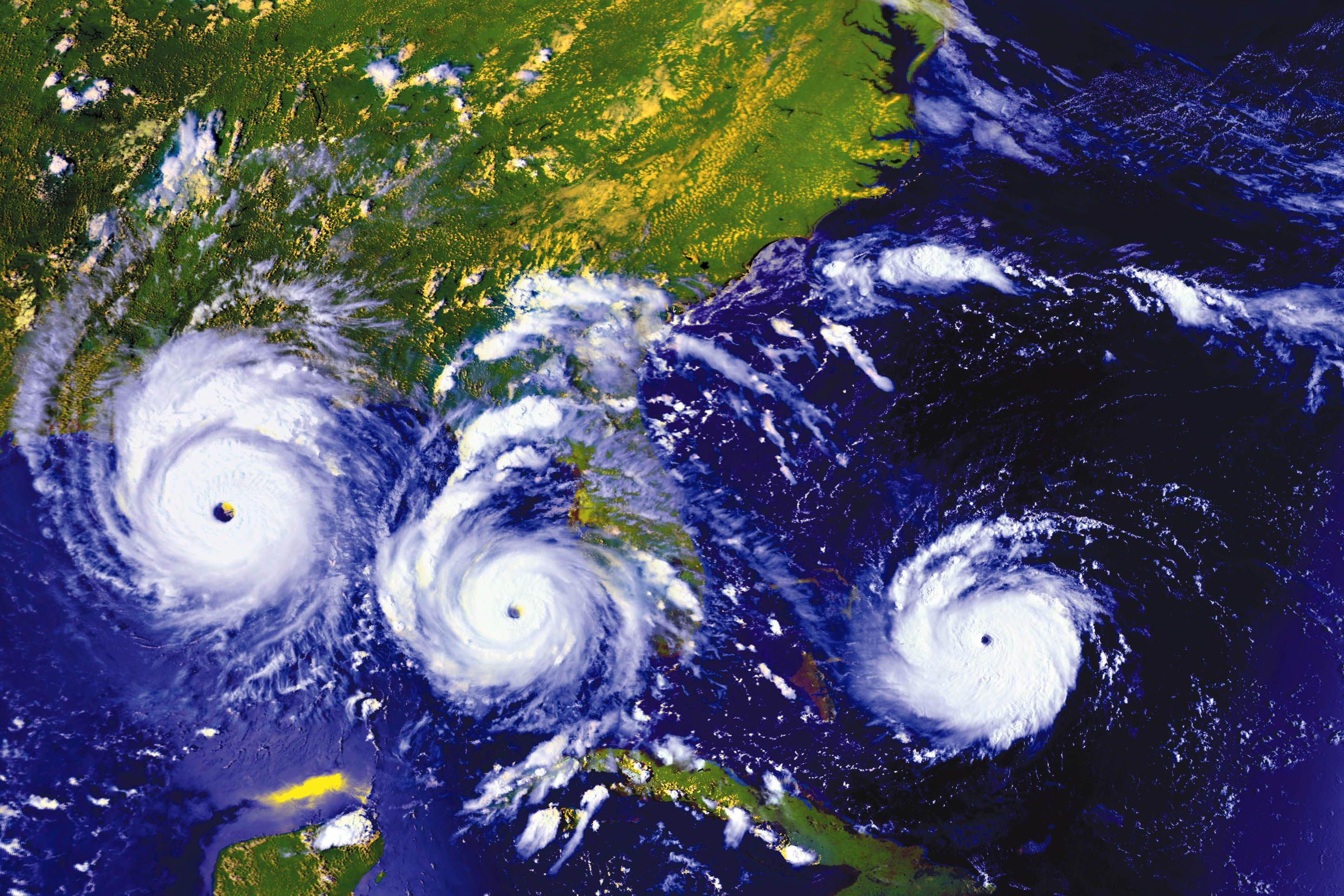
For my major weather event, I chose Hurricane Andrew. Hurricane Andrew made history in 1992 as one of the worst hurricanes ever when it hit both Florida and Louisiana on separate landfalls. It first began off the west coast of Africa on August 16, 1992, where it was relatively inconsequential. It upgraded to a tropical storm on August 17 and continued its way westward. On August 22, it was upgraded to a hurricane, due to a high pressure system that had developed over the southeastern United States. By the next day, the 23rd, it had been classified as a Category 4 hurricane. (NASA has reported it as Category 5). On the 24th, it hit Dade County, Florida. Throughout its course to Florida, Andrew weakened for a period of time. However, it returned stronger than before to devastate southeast Florida. Once its time in Florida was over, Andrew moved back into the Gulf of Mexico, where it eventually hit Louisiana as a Category 3 on August 26. Throughout its time, the highest wind speeds recorded were 169 mph, but some private residences recorded winds up to 177 mph. These winds were so strong that they destroyed instruments used to detect wind speed. In total, Andrew caused about $26.5 billion dollars in damage to the southern United States and directly caused 23 deaths (and an extra 38 indirectly). In all of history, only Hurricane Katrina in 2005 caused more damage.

Below is a satellite  image taken from the National Oceanic and Atmospheric Association:

This image from NASA's Earth Observatory shows Andrew's path between August 23-25.


Sources
 National Oceanic and Atmospheric Association: http://www.ncdc.noaa.gov/oa/satellite/satelliteseye/hurricanes/andrew92/andrew.html

NASA Earth Observatory: http://earthobservatory.nasa.gov/IOTD/view.php?id=78948

Tuesday, October 30, 2012

Google Map Assignment

This assignment details how temperatures and sunrise/sunset times vary for five different cities on similar latitudes on the globe. The data was taken from www.weather.com (The Weather Channel) and the images were constructed in Google Earth. For this assignment, the high and low temperatures recorded are for 10/30/12. Sunset corresponds to when sunset occurred on 10/30/12, while sunrise corresponds to when the sun will rise on 10/31/12. (I posted this at night, and could not find when the sun rose this morning.)

For my first city, I chose New York City, NY. The high was 56 degrees F and the low was 45 degrees Fahrenheit. The sun set today at 5:54 pm and it will rise tomorrow at 7:27 am. Below is a picture of New York City.

My next city was Miami, FL. The high today was 73 degrees Fahrenheit and the low was 56 degrees Fahrenheit. The sun set today at 6:40 pm and will rise tomorrow at 7:29 am. Below is a picture of Miami.

My next city was Bogota, Colombia. The high today was 66 degrees Fahrenheit and the low was 48 degrees Fahrenheit. The sun set today at 5:39 pm and will rise tomorrow at 5:42 am. Below is a picture of Bogota.


The next city I chose was La Paz, Bolivia. The high today was 63 degrees Fahrenheit and the low was 39 degrees Fahrenheit. The sun set today at 6:37 pm and will rise tomorrow at 5:55 am. Below is a picture of La Paz.

My last city was Santiago, Chile. The high today was 75 degrees Fahrenheit and the low was 50 degrees Fahrenheit. The sun set today at 8:09 p and will rise tomorrow at 6:43 am. Below is a picture of Santiago.

Finally, here is a Google Earth image of all five cities marked to show their similarity in latitude.

Thursday, October 18, 2012

Wind Rose Plots

These wind rose plots were taken from data found from the SCRAM Surface Meteorlogical Archived Data. The following plots are from November 11, 1992, which happens to be the birthday of yours truly. :) Below is the original plot, which shows where the wind was from that day:

Next, the same plot is overlayed on a Google Earth Image, which shows that the weather station in Atlanta where the data was recorded is located at Hartsfield-Jackson International Airport.


Finally, the plot was reversed (to show where the wind was blowing to) and overlayed on a Google Earth Image.

Monday, September 3, 2012

Hurricane Isaac

Here's a video with a view of Hurricane Isaac from space.

 
And here is Isaac down in Florida on the 27 of August, 2012.

Environmental Sensitivity Index Map

An environmental sensitivity index map uses symbols to represent environmental hazardsor concerns. For example, a symbol of a seal would indicate that an area would contain an endangered species. The image below is an example of an environmental sensitivity index map.


Source: http://www.mytropicalescape.com/2007/06/27/where-the-heck-is-culebra/

Proportional Symbol Map and Isopleth Map

A proportional symbol map is used to describes proportions in relation to a set of data.The larger the dot or symbol, the higher the proportion. For instance, the map below shows the porportion of Walmart stores in each state. Source: http://personal.frostburg.edu/sbriggs0/maps.htm


An isoleth map uses shaded linesto define regions of data. For example, an area between shaded lines would indicate how much rain had fallen in the area in the past year. The image above demonstrates average temperatures in different regions. However, the above image is easily confused with a choropleth map, due to the coloring of the regions.

Source : http://www.cpc.ncep.noaa.gov/products/analysis_monitoring/regional_monitoring/clravt.gif


Dot Density Map


A dot density map uses dots asa place marker to label different sets of data.For instance, the map above shows the population of the United States. Areas with a higherconcentration of dots represents a higher population.
Source: http://ahtanu.tripod.com/images/dot-density.gif

Choropleth Map

A choropleth map is a map that is color-coded by zones, used to distinguish different pieces of data. A popular example is an election map, which often color-code states based on the voting population. A goof choropleth map contains a legend and scale bar, and many require having the North arrow somewhere on the map to establish direction.  For instance, this map compares how many males reside in each state compared to 100 females.
Source: http://my.ilstu.edu/~jrcarter/Geo204/Choro/